
- The Basics of Color Theory for Your Wardrobe
- 4 Proven Color Matching Formulas
- The Power of Neutrals: Your Secret Anchor
- Matching Clothes to Your Skin Undertone
- Seasonal Color Palettes and Occasion Styling
- 4 Common Color Matching Mistakes (and How to Avoid Them)
- Putting It Into Practice: Building Your Daily Outfits
- Frequently Asked Questions
 how to match colors in clothes
Standing in front of a closet packed with garments while feeling like you have nothing to wear is a universal experience. More often than not, the problem is not a lack of options—it is a lack of color harmony. Understanding how to match colors in clothes transforms your daily routine from a stressful guessing game into an effortless creative process.
When you know which colors complement each other, putting together an outfit becomes fast, intuitive, and fun. You do not need an art degree or an innate sense of high fashion to master color matching. By learning a few simple rules of
color theory
, recognizing neutral bases, and understanding your own undertones, you can build versatile, stylish outfits for any occasion.
This fashion color guide walks you through the practical steps of styling colors with confidence, helping you create well-balanced clothing color combinations using items you already own. You can also explore more ideas on creating more outfits from your existing wardrobe to maximize your clothing choices.
The Basics of Color Theory for Your Wardrobe
At the heart of every great outfit lies color theory. Understanding how colors influence perception is also an important part of color psychology and design principles. While it might sound technical, color theory for fashion is simply a visual map showing how different shades relate to one another. The easiest way to visualize this is by looking at the classic color wheel.
The color wheel consists of twelve basic hues categorized into three primary groups. You can learn more about professional color relationships through this color wheel guide.
- Primary Colors: Red, blue, and yellow. These are pure colors that cannot be created by mixing others.
- Secondary Colors: Green, orange, and purple. These are created by mixing equal parts of two primary colors.
- Tertiary Colors: Shades like blue-green, red-orange, and yellow-green, made by blending primary and secondary colors.
Understanding Temperature: Warm vs. Cool Tones
Every color on the wheel has a temperature:
- Warm colors include reds, oranges, and golden yellows. They evoke warmth, energy, and warmth, making them ideal for drawing attention or creating cozy, autumnal looks.
- Cool colors encompass blues, greens, and lavender-toned purples. Cool shades tend to feel calming, crisp, and understated.
Knowing whether an item leans warm or cool is key to mixing outfit colors effectively. As a general rule, pairing colors with similar temperature undertones creates a naturally harmonious look, while mixing warm and cool tones provides dynamic, high-contrast visual interest.
4 Proven Color Matching Formulas
If you are unsure where to start, rely on tested color combinations. These four formulas act as cheat codes for effortless styling, helping you choose clothes that look intentionally put together every single time.
1. The Monochromatic Formula
Monochromatic dressing involves layering different shades, tints, and tones of a single color family. Contrary to popular belief, monochromatic does not mean wearing the exact same shade from head to toe—in fact, varying the saturation is what makes the outfit look sophisticated.
- Example Outfit Idea: Pair a dark navy wool coat with a light blue knit sweater, dark-wash denim jeans, and navy suede shoes.
- Why It Works: It creates a long, uninterrupted vertical line that flatters your silhouette while remaining foolproof and polished.
- Styling Tip: Mix different fabric textures—such as leather, knitwear, and denim—to add depth so the single color tone does not look flat.
2. The Analogous Formula
Analogous color schemes use two or three colors that sit right next to each other on the color wheel. Examples include green and yellow, blue and violet, or orange and red.
- Example Outfit Idea: Combine an olive green utility jacket with a soft mustard yellow sweater and medium-wash blue denim.
- Why It Works: Because these hues share common primary roots, they flow naturally into one another without clashing, offering a subtle pop of color.
- Styling Tip: Let one color take center stage as the primary garment while using the neighboring color as an secondary layer or accent.
3. The Complementary Formula
Complementary colors sit directly opposite each other on the color wheel. Think blue and orange, red and green, or yellow and purple. High-contrast combinations like these instantly command attention.
- Example Outfit Idea: Wear a deep cobalt blue blazer over a neutral cream shirt, paired with rich rust-orange accessories like a scarf or leather shoes.
- Why It Works: Opposite colors amplify each other’s brightness, making both shades pop.
- Styling Tip: Direct complementary pairings in full saturation (like vibrant primary red and true green) can look overly bold or holiday-themed. Soften the contrast by choosing muted or deep tones, such as burgundy and forest green or navy and terracotta.
4. The Triadic Formula
A triadic arrangement uses three colors spaced evenly around the color wheel, forming a triangle. Classic examples are red, yellow, and blue, or purple, orange, and green.
- Example Outfit Idea: A dark olive green jacket (muted yellow-green), navy trousers (blue-violet), and a soft muted coral shirt (red-orange).
- Why It Works: It offers high color balance, giving an energetic yet grounded impression.
- Styling Tip: Choose one color to dominate 60% of your look, use the second for 30%, and reserve the third for a 10% accent.
The Power of Neutrals: Your Secret Anchor
While learning how to match vibrant shades is exciting, neutral colors are the real backbone of any functional wardrobe. Building a foundation with essential wardrobe basics makes color coordination much easier. Neutrals are flexible shades that pair seamlessly with almost any other hue—including each other.
The Essential Wardrobe Neutrals
- Black: Sleek, formal, and slimming. Pairs effortlessly with almost every vibrant tone.
- White and Cream: Brightens any ensemble. Cream offers soft warmth, while bright white provides crisp clarity.
- Navy Blue: A softer, highly versatile alternative to black that adds richness to warm and cool shades alike.
- Grey: The ultimate balancing shade, ranging from charcoal to soft heather grey.
- Beige, Tan, and Brown: Warm, earthy bases that add richness and sophistication to everyday wear.
- Denim: While technically a blue hue, classic denim functions as a neutral bottom in casual and smart-casual outfits.
Applying the 60-30-10 Rule
To prevent your clothing color combinations from feeling overwhelming, apply the interior design secret known as the 60-30-10 rule:
- 60% Dominant Color: Your main garment, usually a suit, coat, trousers, or dress (often a neutral shade).
- 30% Secondary Color: Your supporting piece, such as a shirt, sweater, or blouse that provides contrast.
- 10% Accent Color: A small pop of color found in shoes, belts, scarves, pocket squares, or jewelry.
For instance, a charcoal grey suit (60%) paired with a crisp white shirt (30%) and a deep crimson tie (10%) creates an instantly structured, polished presentation.
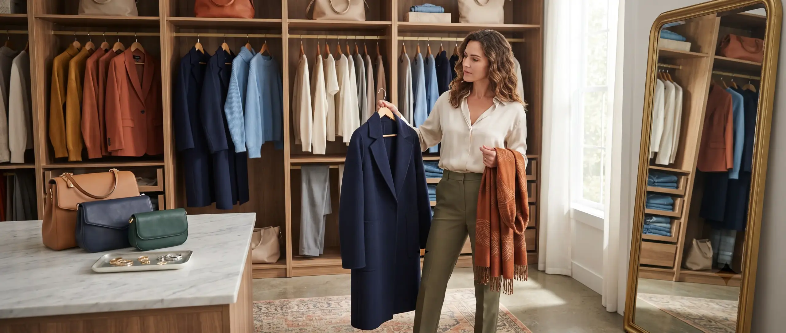 clothing color combinations
Matching Clothes to Your Skin Undertone
While any color scheme can be aesthetically balanced, Choosing shades that complement your unique skin undertone ensures that your clothing enhances your natural complexion. For more background on textiles and clothing, you can explore resources from the Textile School., making you look energized and refreshed rather than washed out.
Skin undertones fall into three main categories: warm, cool, and neutral.
How to Determine Your Undertone
- The Wrist Vein Test: Look at the veins on the inside of your wrist under natural sunlight. If they appear blue or purple, you likely have cool undertones. If they appear greenish, you have warm undertones. If it is difficult to tell, you likely have neutral undertones.
- The Jewelry Test: Does silver or gold jewelry make your skin look more radiant? Silver flatters cool undertones, while gold brings out the richness in warm undertones.
Choosing Your Best Palette
- For Cool Undertones: Look for cool-toned hues like royal blue, emerald green, deep plum, bright white, and icy pastels. Stick to cool grey and slate as neutral anchors.
- For Warm Undertones: Lean into warm earth tones like terracotta, mustard yellow, olive green, warm taupe, cream, and warm chocolate brown.
- For Neutral Undertones: You have the flexibility to wear almost the full color spectrum. Medium-toned hues like soft jade, dusty pink, or classic navy look exceptional on you.
Seasonal Color Palettes and Occasion Styling
Adapting your outfit colors to the season and context creates an effortless sense of style appropriateness.
Adjusting Tones for the Seasons
- Spring: Focus on fresh, light shades like mint green, soft peach, light lavender, and sky blue paired with light beige or white.
- Summer: Lean into rich, vibrant colors like bright turquoise, sunshine yellow, and corals balanced by crisp white or light chambray.
- Autumn: Embrace deep, rich shades like burnt orange, mustard yellow, olive green, burgundy, and warm camel brown.
- Winter: Accentuate high-contrast pairings using saturated jewel tones—ruby red, sapphire blue, emerald green—anchored by black, dark grey, or deep navy.
Color Matching by Occasion
The context of where you are going should guide how many bold colors you introduce:
- Professional Environments: Keep the dominant 90% of your outfit neutral (navy, charcoal, black, beige) and introduce color subtly through soft-toned shirts or subtle accessories.
- Smart-Casual Events: Experiment with analogous pairings or subtle split-complements, such as pairing an olive blazer with dark indigo jeans and a cream knit sweater.
- Casual Outings: Take creative freedom. Use contrast, bold complementary combinations, or playful accent shoes to express your personality.
4 Common Color Matching Mistakes (and How to Avoid Them)
Even with good intent, simple styling slip-ups can throw off an otherwise great outfit. Here is how to fix the most common mistakes:
1. Over-Matching Accessories
Matching your shoes, belt, handbag, hat, and watch strap in the exact same vivid accent color can look rigid and outdated. Instead of matching every accessory perfectly, let your shoes and belt stay grounded in classic neutrals while allowing a single accessory—like a scarf or pocket square—to provide the color focus.
2. Combining Similar Dark Neutrals Without Contrast
Wearing black and dark navy—or dark brown and black—can sometimes look like an accidental mistake rather than an intentional choice if the shades are too close in value. If you want to mix dark neutrals, ensure there is a clear distinction in texture or shade depth so the contrast looks deliberate.
3. Fearing Color Altogether
Relying exclusively on black, grey, and white is comfortable, but it can make your wardrobe feel repetitive over time. You do not need to wear head-to-toe neon to break out of a color rut. Start small by introducing soft earthy tones like sage green or muted dusty blue into your neutral rotations.
4. Ignoring Contrast Ratios
Wearing items that share the exact same lightness value from top to bottom can wash you out or make your outfit lack definition. Always aim for a balance of visual weight—pair lighter tops with darker trousers, or layer a rich dark jacket over a bright light tee to create crisp dimension.
Putting It Into Practice: Building Your Daily Outfits
Mastering how to match colors in clothes does not mean throwing out your existing clothes and starting over. This approach also supports more sustainable clothing habits promoted by organizations such as the United Nations Environment Programme. A well-organized closet and proper clothing care routine help you get more value from every piece you own. Begin by organizing your closet into two clear categories: your neutral base garments and your colored accent pieces.
When building an outfit each morning, follow this step-by-step mental checklist:
- Pick one neutral base item: Start with your bottoms or outerwear (e.g., navy trousers or a camel coat).
- Select your core colored garment: Choose a sweater or shirt that matches your undertone or uses a formula above (e.g., an analogous light-blue knit or a soft sage-green tee).
- Check your temperature balance: Ensure your warm and cool tones complement each other comfortably.
- Add subtle accents: Finish with footwear and accessories that anchor the look without overwhelming it.
By building your look around balance rather than guesswork, you will consistently craft outfit ideas that feel cohesive, personal, and effortlessly stylish. Color matching is ultimately an artistic skill—once you understand the fundamental rules, you gain the freedom to break them with confidence.
Frequently Asked Questions
How do I use the color wheel to start matching colors in my outfits?
Understanding the color wheel is the absolute best starting point when learning how to match colors in clothes. You can create balanced outfits using three main color strategies: complementary, analogous, and monochromatic. Complementary colors sit opposite each other on the wheel, such as blue and orange, creating vibrant contrast. Analogous colors lie next to each other, like green and yellow, offering a harmonious look. Monochromatic styling uses different shades of a single hue for a sleek, modern aesthetic. If you are ever unsure, start with neutral bases like black, white, gray, or beige, and add a single accent color from the wheel. Using a simple fashion color guide makes experimenting with different clothing color combinations both fun and stress-free.
What are neutral colors, and how do they make color matching easier?
Neutral colors are versatile shades that do not compete with other hues, making them essential for effortless color matching. Classic neutrals include black, white, navy, gray, tan, and cream. These grounding tones act as a blank canvas, allowing you to pair almost any bright or muted shade with them seamlessly. For beginner-friendly outfit ideas, try pairing a bright red sweater with classic navy trousers, or an olive green jacket with a simple white shirt. Neutrals take the guesswork out of choosing your outfit colors because they naturally complement nearly everything in your wardrobe. Building a strong foundation of neutral pieces will instantly simplify your daily routine and boost your confidence when styling colors. Learning proper fabric care and clothing maintenance also keeps these essential pieces looking their best.
What is the easiest rule for beginners to follow when learning how to match colors in clothes?
The easiest rule for beginners learning how to match colors in clothes is the three-color rule. This strategy suggests keeping your overall outfit limited to a maximum of three main colors at a time. Typically, you should choose one primary base color for your main pieces, a secondary supporting color, and an optional third accent color for accessories like shoes, bags, or jewelry. For example, you might wear a navy blue suit with a light blue shirt and burgundy leather shoes. Following this simple approach prevents your clothing color combinations from looking overwhelming or chaotic. It offers a foolproof framework for mastering styling colors while keeping your look polished and cohesive.
How do I choose outfit colors that look best with my personal skin tone?
Selecting the best outfit colors for your wardrobe becomes much easier once you determine your skin’s undertone. Generally, skin tones fall into three categories: warm, cool, or neutral. If you have warm undertones with golden or olive hues, earth tones like mustard yellow, terracotta, warm reds, and deep greens will highlight your natural glow. If you have cool undertones with pink or bluish hues, crisp whites, jewel tones, navy, and soft pastels will look stunning on you. Neutral undertones look great in almost every shade across the fashion color guide. Paying attention to how different shades react near your face will help you feel more confident when styling colors for any occasion.
How can I incorporate patterned clothing without ruining my outfit’s color balance?
Matching colors in patterned clothing is surprisingly simple when you follow the dominant color technique. When wearing a printed piece, such as a floral shirt or plaid blazer, look closely at the design and pick out one main color. Then, choose solid-colored clothing items that match or complement that specific hue. For instance, if your patterned skirt features navy, soft pink, and white, you can pair it with a solid soft pink top to create a harmonious ensemble. This approach guarantees clean color matching without creating visual clutter. It also allows you to experiment with creative outfit ideas while maintaining balanced clothing color combinations every time.

Related Posts

how to style a t-shirt Every wardrobe has one item

capsule wardrobe for everyday wear Standing in front of a

how to style basic clothes Most people believe that looking

neutral colors for outfits Standing in front of a closet
 WhatsApp
 Messenger
 Phone
Phone